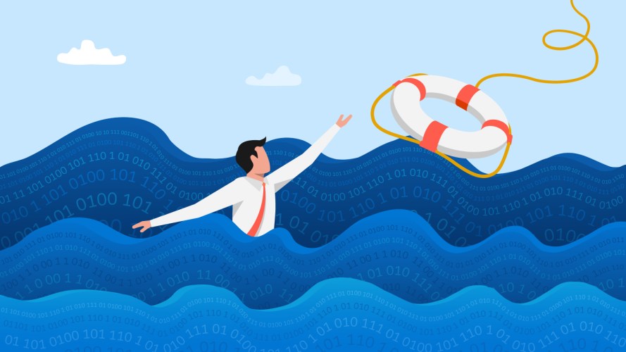
Reporting and Dashboards Blog

Reporting and Dashboards Blog

Reporting and Dashboards Blog

  • Reporting and Dashboard features in Winter’10 – the list and “Color tuner”.

    Thomas Tobin Sep 2, 2009

    Now pre-release is available, we can start to talk about the features in Winter’10. There were 5 features destined to be in Winter’10. Internally, our list was:

    1. colors
    2. hover
    3. others
    4. multi
    5. drill

    This made it (oddly enough) easy to remember. But now there’s the list, we can go on to the first one. Colors, and the Color Tuner.

    Color Tuner

    Color tuner is a simple idea – the idea here:

    image

    and here

    image

    and is “if this thing appears in one chart as one color, it should be the same color in other charts, and I want to set the color”.

    Most tools

    Many tools would let you set the color in the chart for each element. Some might even not let you set the colors, even if they are fancy BI tools that cost lots of money per seat. But that seemed bad:

    • you’d have to redefine the colors for each chart
    • If you and a co-worker build charts, you’d have to discuss the colors beforehand to stop “fisheries” showing up red in one set of charts, and green in your co-worker’s charts

    So, we took a different tack… We wanted to fix the colors of chart everywhere in salesforce.com.

    Part of the metadata

    In the picklist definition, you have the set of picklist options:

    image

    so, here seemed the right place. If Fisheries is supposed to be green, make it green when you define it. When anybody edits something, you define a color, and the colors are applied everywhere. Let’s see that list in Winter’10:

    image

    Now, I can do 3 things:

    1. Globally assign a set of colors
    2. Globally remove all colors
    3. Set or unset a color from a specific picklist value

    So, looking at one of the edit pages for one value, I can see the color choice:

    image

    and I can set the color

    image

    Now I can see the list of picklist values with their colors

    image

    Now, returning to my chart, I can compare the before and after:


    Before

    Winter’10 with colors assigned

    all months image image
    just october 2008 and august 2009 image image
     

    Technology goes from Orange to Green as the values visible change

    Technology stays a super pink!

    Also, this affects all charts in all dashboards – technology will now be pink everywhere, so two charts next to each other with Industry as a grouping will show technology in pink also

  • Breaks in lines with the new chart engine

    Thomas Tobin Jun 18, 2009

    Ok, so there’s a missing blog post covering the new features in the new Summer’09 release. But let’s start at the end and work backwards.

    In the new charts in the summer release, there are a set of changes described in the Release Notes where we go into detail on the changes. Of course, if you are a new customer, there are no changes – there is only the charts in Summer’09, and you won’t know what the fuss is about.

    One of the things we changed was the way that line charts of grouped lines and cumulative lines shows when there were breaks in the lines.

    Data or not?

    When I looked at the old charts, and there were gaps in the data, my heart would sink. It would sink to the 0 level of the axis, where I could see all the lines there.

    image

    And I always think “well, is the value for “negotiation/review” for May really 0? or was there no data?

    Enter the Brave Few

    Happily, one of the thought leaders on visualizing data, has already thought about it, in a paper on how to deal with charting on irregular intervals.

    His view is that you can’t plot anything there. That is good for two reasons:

    1. makes sense
    2. is what you were taught in school (this line isn’t continuous)


    We only have this problem in two cases – for grouped line charts, where the x-axis values are set by multiple lines, and so (as in the example above) you can see “gaps” in some of the series compared to others. Above, “Needs Analysis” is stable over all the dates, whereas “negotiation/review” is not.

    In Summer’09

    Now the new picture (with the same data)

    image

    Now, the “broken line” is something you probably won’t see often (I had to cheat here to get it to show something strange). But the lines that end are something you’ll probably see when dealing with historical data (like a snapshot) or with the latest period, where not all data might be valid - for instance, looking at opportunities in the future and their stages – hopefully none are in “closed/won” but closing in December 2012.

  • IDE part 2 - using Search and Replace

    Thomas Tobin Jun 14, 2009

    So, in Part 1, we covered creating a project, and being able to delete reports. Some people were already happy about that - see the end of Mass delete reports:

    image

    It warms the cockles of my heart!

    So, once you've cleaned up the old reports we wanted to delete, what else can we do? How about changing things in reports?

    Search and Replace - changing filter values

    One thing that comes up a lot in wanting to change reports is looking for "old" filter values. These might be from picklists or member status, or territories. So, what can we do?

    Well, let's say we have reports on opportunities, and we want to change the opportunity stage names. Normally that would mean going to the reports, and changing what we were looking at. Now, we can use the powerful search and replace in eclipse to do our work.

    An Example - stage name

    So, I have filter definition on stage name. I'm filtering in my reports to only show stage 1 to 3, but I see that the third one -  “Needs Analysis” isn’t used much:

    image

    In the query I have:

    image

    Now, I want to get rid of “Needs Analysis”. I can do that in the picklist editor, by deleting the picklist value, and moving those opportunities to “Qualification”:

    image

    But my reports still filter on the old value.

    Or, I might have chosen “None” in the replacement value, then they would all still stay “Needs Analysis” – maybe I am migrating to new settings, maybe I’m converting 2 statuses to 1 new one.

    In the IDE:

    I can now see this in the IDE:

    <filter>
        <criteriaItems>
            <column>STAGE_NAME</column>
            <operator>equals</operator>
            <value>Prospecting,Qualification,Needs Analysis</value>
        </criteriaItems>
    </filter>

    andfdf

    So, let’s says I want to:

    find places where the text appears in the the <value> block of a report file

    image

    Then I can ask it to search (but don’t hit the “search” button), I’m about to explain the contents

    image

    Here, I’ve clicked the “Regular Expression” checkbox. Rather than making things more normal (like Regular Coffee, or Regular Joe), this allows me to do something special.

    The first part of the “containing text” is (<value>.*) – the parentheses mean that this is a “capturing group” – that we are going to be able to use later. This means, find something that starts with <value>, then has any number of any characters. Then the next part says “Needs Analysis”.

    I also want to search only in report files – where the pattern is *.report – any file ending in .report

    Now, hit the “replace” button, and this appears:

    image

    And here’s where it gets weird. We want to replace it with $1? You can’t even buy a coffee for a dollar (yes, I live in expensive San Francisco).

    No. The “$1” means to replace that text with whatever the search found in the parentheses – so it will replace it with “<value>” followed by whatever else was before the “Needs Analysis”, followed by the replacement value I’ve chosen.

    DON’T HIT THE “REPLACE” BUTTON UNLESS YOU ARE REALLY SURE!


    You want to try this in a dev org, or with a single file, or where you have the files versioned, because as soon as you press “replace”, it will replace in all files, and put that file back on the server.

    Now, for a split second, the code looks like this:

    <filter>
        <criteriaItems>
            <column>STAGE_NAME</column>
            <operator>equals</operator>
            <value>Prospecting,Qualification,Qualification</value>
        </criteriaItems>
    </filter>

    and you’ll wonder what in the Sam Hill is going on, before the save/verify/download logic build-in to the IDE takes over, and makes the code look like this:

    <filter>
        <criteriaItems>
            <column>STAGE_NAME</column>
            <operator>equals</operator>
            <value>Prospecting,Qualification</value>
        </criteriaItems>
    </filter>

    and then you are done!

    Here, the IDE has uploaded your code to the server, which looked at the filter, and decided two of the picklist values were the same, and it’s sent it back to the client with the duplicate removed.

    Remember:

    1. practice in a developer org (they are free!)
    2. back up your .report files
    3. Run “Search” to make sure you find what you want
    4. Run “replace in file” to try one file at a time
    5. Be lucky!
  • New reporting features in Spring'09

    Thomas Tobin Jan 24, 2009

    It only seems like a month or two ago that I was extolling the virtues of the analytics features in the Winter'09 release. But here we are again, and it's that time again.

    This weekend, Sandbox rolled out with the new features, and pre-release has been available for a while - looking at the end of the status page, you can see the release-related maintenance windows.

    We'll go in order of the easiest to understand to the hardest:


    Dashboard Finder

    Do you have troubling finding your dashboards? Have too many? Without trying to sound like an infomercial about how opening jars will get you to prison, I know I do.

    There's no idea for this one to show how popular it is, but we've seen when watching users use salesforce.com that people can't find one named dashboard in the long list that's on the

    Turning it off and on

    If you want to turn it off and on, that's in the setup | customize | User Interface page. It's on by default. In testing, 9/10 admins said their cats preferred it. Or was that some catfood? But when doing the usability tests, most users though that it should be on by default,  they wouldn't turn it off, and that users used to the old way of doing things would not get confused.

    image

    Using it

    So, you are looking at a dashboard, and want to see another. You can click the down-button to deploy the list just like always:

    But you can also type into the box, and it will search as you go. For a better picture of this working, you can look at the new release demo for the Dashboard Finder

    Summary Snapshots

    Summary snapshots was an idea on IdeaExchange created just after we released Analytic Snapshots. Really, it was part of the snapshot vision imagewhen we started (yes, I really do know everything but I am also very modest). In that first release, we were only able to get tabular datasets to work, but we'd already done the usability and other work to use a summary report as the source.

    To use start snapshotting summary data, you select a source report that's a summary (matrix can't work for reasons I'll outline when I look at the feature in more depth), then choose which level of summary you want to map, and then schedule, and Bob is your uncle.

    As with the Dashboard finder, there's a release demo for Summary Snapshots showing you the steps involved, but really, if you've used the current analytic snapshots, it will be a tiny step to using these ones.

    With summary snapshots:

    • So long as you insert less than 2000 rows, your report can go over many more
      • You can report over hundreds of thousands of rows, and summarize down to categories or groupings, then store data for the groupings
    • you can snapshot multiple metrics at the same time
      • If your report calculates average days to close deals, as well as average deal size, and is grouped by industry, lead source, and geography, you can snapshot all of that information
    • you can then use the data in the snapshot object as the source of another report


    If you have a metric you are tracking in your business (like average days to close) then now's the time to use the same report you are using on the dashboard, snapshot it, and start to watch the trend as your business changes.

    Accessing Previous and Parent Group Data

    imageThis is one of the hard to explain features. You'll see why it's useful in an example. Currently, in Custom Summary Formulas - the formulas you build to do calculations in summary and matrix reports - you can only get the values for the current grouping. With the new features, you can use two formulas - PREVGROUPVAL to get values from either cells above or - in matrix reports - to the left. The other function - PARENTGROUPVAL - allows you to get values from calculations in summary levels higher than the current one.

    So, If you wanted to get a "this q vs last q" difference amount, you'd use PREVGROUPVAL.

    If you wanted to get "this product as a % of all products", you'd use PARENTGROUPVAL.

    There's also two mini-features that were necessary to deliver this one:

    1. Allowing Custom Summary Formula fields to be only calculated in some contexts
      • pre-Spring'09, formulas were calculated at all levels - for instance, totaling pipeline size also gave nonsensical totals over all time - amounts of money that never existed. With Spring'09, you can now choose where the calculation should be done. 
      • Functions using PrevGroupVal and ParentGroupVal can only be valid in one context
    2. A new Custom Summary Formula builder that gives you a lot more help when building the functions.


    There is a video showing the new summary formulas that you can look at for a quick introduction to the features

    And together, all these 4 features make up one of the 3 big features we're delivering as part of Spring'09!

  • Databases in the cloud

    Thomas Tobin Jan 12, 2009

    Today in Monash's post on Database Saas they mention the analytics part of salesforce.com as one end of the continuum of "data market outsourcing".

    Just in case you'd forgotten, salesforce.com is more than the database - there are Database Services but also services to manage that, query it, and build forms - the whole platform, as well as a set of partners providing analytics solutions on AppExchange.

    But in the Monash blog post, they do go on to list other providers who may be a better fit if you don't need (or want) the rest of the salesforce.com platform, and want SQL or ODBC access to your data (rather than SOQL).


  • Database in the cloud

    Thomas Tobin Jan 12, 2009

    Today in Monash's post on Database Saas they mention the analytics part of salesforce.com as one end of the continuum of "data market outsourcing".

    Just in case you'd forgotten, salesforce.com is more than the database - there are Database Services but also services to manage that, query it, and build forms - the whole platform, as well as a set of partners providing analytics solutions on AppExchange.

    But in the Monash blog post, they do go on to list other providers who may be a better fit if you don't need (or want) the rest of the salesforce.com platform, and want SQL or ODBC access to your data (rather than SOQL).

  • Browser share

    Thomas Tobin Jan 2, 2009

    There have been a few articles about changing market share for browsers and whether browsers are supported by services. Since I have the reporting tools, and as it's the end of year and so I have a full set of data for 2008, I thought I'd share some information on how salesforce.com's service has seen browser versions change. If you are looking for total share numbers, normally Jerry covers that - e.g. in June 2008 he shared his results on browser share. There are also a set of good comments in that article in response to Jerry's questions about how users use IE6 and whether they can upgrade.

    We're a web application used normally by businesses - so our total numbers might not line up with somebody measuring all accesses from all browsers.

    Versions of IE

    Here is the split between May 2004 and December 2008 - you can see when IE7 came out, and is slowly being pushed down to upgrade IE6. IE8 isn't statistically significant yet - it's still in beta as of January 2009.


    Internet Explorer changes fairly slowly - users are either happy with their current experience, don't want to upgrade, or are not in control of their PCs. For instance, in one of the comments in Jerry's blog post above, the user says that their IT department controls the deployment over their 5000 PCs


    Version of Safari

    The Safari version split shows a quicker movement from version to version - particularly version 3 which replaced all the other versions pretty quickly. I'm not sure why the number of 1.3 and 2 versions went back up - it's probably be customers trying Safari 3 on Windows - released in March 2008 - then going back to other browsers or switching to FireFox 3 because they are the cool kids.


    For instance, in this idea to make Safari 3 supported - it says Safari was faster than the FireFox at the time. Then there were articles saying FF3 was faster than Safari 3 so people must have then changed again - and looking below, when Safari 3 is loosing ground, it's when the avalanche of users upgrading to FireFox 3 is happening.

    Firefox

    One look at the FireFox graph below tells the story of a quick upgrade cycle. People are definitely in control of their Firefox installations, and seem to press the "upgrade" button without hesitation. And it's getting faster each time! That nagging window telling you to upgrade to a new experience really works.


  • Scheduling and Emailing reports in salesforce.com

    Thomas Tobin Nov 30, 2008

    So, another feature that had been widely requested was the ability to grab the results of a printable view of the report, and send it to a set of users:


    Getting scheduling to work:

    I'm going to assume that either

    1. your user has a "System Administrator" profile, so you have this turned on in your profile
    2. your local administrator has turned this on for you, so you'll be able to schedule for yourself
    3. If you are using custom administrator profiles, you may or may not have this turned on depending on your other permissions

    so we'll leave the permissions/profile discussion to a local one - I'm going to assume you have the right to schedule.

    Viewing a report today
    When you view a report in Winter'09, you should see an extra control on the "Run Report" button.

    This new down-arrow allows you to select between two choices:

    You can run the report now - the default if you click the button, and what was the only choice, or you can schedule the report to be run.
    Just like when you schedule a dashboard, you can choose the destination emails.
    Who you can send to depends on who can see the folder where the report is saved. If it's in your personal folder, there won't be a lot of choices.
    If it's in a public folder, then you can choose pretty much anybody.
    Otherwise, if it's in a folder shared to a set of roles, groups, or users, you can choose from them:

    The last options are different from the options on the dashboard scheduling page. When scheduling, you might have changed the report before scheduling it. Since you might expect to schedule the one you've been working on, the first option lets you save the report as-is, and the schedule you are setting up.
    Alternatively, you can schedule the report based on the last saved version of the report - and discard the current set of report changes you've done.

    What you get


    So, what do you get in your email?
    You get the output of the printable view, with a few small additions to make sure things make sense:
    the running user is displayed, the time it ran was displayed, then there is the list of filters present (so you have some context).

    And that will arrive every time you asked! Easy!

    If you ever have problems, keep any mails that turn up - not just the content, but also the headers. We've seen instances in support where we sent the mails on time, but they were held up somewhere along the way, so keep the email and know how to get to the "internet headers" as they are sometimes called. This allows support to work to find where there was a problem.

  • Using the Eclipse Plug-in to change reports in salesforce.com Winter'09

    Thomas Tobin Nov 17, 2008

    One of the additions in the Winter'09 version of salesforce.com was the addition of reports, dashboards, and their folders t the metadata API.

    The two kinds of API

    There are two kind of different APIs in salesforce.com

    • The data API
      • This is the API that s-controls use, that Apex uses, and it lets you do many things. For instance, it allows you to create Accounts, change custom object records, get lists of Cases, and create workflow.
    • The metadata API
      • This is the API that can create objects, get lists of folders, create fields on objects, and now, thanks to the miracles of science, list, create, edit, and delete custom reports

    In the Winter'09 release of Salesforce.com, the reports are part of that Metadata API, and you can list them, create them, delete them, and change them.

    But what if you are not a programmer? What if you just want to mass delete?

    The Eclipse IDE.

    Salesforce.com has an plug-in for Eclipse. Eclipse is a standard IDE, developed by the community, and a set of companies. Before, every company made it's own IDE.

    IDE - is an Integrated Development Environment. It's designed to let you do everything you'd want to do to develop. You might say "Hey! I'm an Admin, I don't want to develop". But you do - you want to develop reports!

    Back when every company made it's own IDE, the world was less fun. Oh, the area behind my house was all trees and majestic herds of wildebeest roamed the land, but you had to learn a whole new way of doing things when you changed what you worked on. Unless it was the wildebeests.

    What you'll need:

    You'll need a two ingredients:

    • The Europa EE build of Eclipse
      • you can get this from the Europa Eclipse download site
      • you need the Europa EE version because it includes everything you need, and we don't work with the newer versions yet
      • You need to install Eclipse, just unzip the file somewhere
    • The salesforce.com plug-in

    Getting started in the IDE

    The first thing you need is a project - which is, for a salesforce.com project, a connection to salesforce.com with a login:

    image

    Then you'll be able to fill in the login details. You should never need to change the "Environment" choice:

    image

    Next, you should see progress - a progress bar as it downloads the configuration behind your salesforce.com login.

    Then, you'll see a new dialog box where you can choose what to download. The easiest way to do this for reports is to choose the option "Selected metadata components" and press the "Choose..." button.

    image

    Then, we get to choose the reports:

    image

    Here, I've chosen to get anything in the "Activityreports" folder, plus one of the reports from the "Campaign Influence Reports".

    And now we can see what we're going to download:

    image

    Now the exciting part! Progress!

    image

    And now, we can see all of the project's contents in the folder/package view of Eclipse:

    image

    Ok, now what?

    Well, first, let's do a mass delete. First, select some reports:

    image

    I've just selected the first, held Shift and clicked the last. I can also ctrl-click on reports to select random reports from the list.

    Then press the delete key on my keyboard, and: image

    then the best bit: image

    Yes! Yes!


    Ok, next time, using search and replace....